archivea-magazine
Wild Archivea — Editorial Design & Concept Branding
Wild Archivea is an independent magazine project that reimagines the quiet strength and sensory experience of a forest through a physical medium. From the initial naming and branding to the final layout and content curation, I directed every element to ensure the publication felt like a "walk through the woods" for the reader.
Role and Scope
- Concept Strategy & Naming
- Editorial Layout Design
- Visual Direction (Typography & Color Palette)
- Content Curation & Structuring
Objectives
- Reflect Sensory Experience: Use the magazine format to mirror the textures, flow, and atmosphere of a forest.
- Calm Readability: Create a layout that guides the reader without visual clutter, fostering a sense of focus.
- Visual Consistency: Establish a cohesive brand identity using a palette of soft greens and ivory tones.
- Technical Mastery: Develop a deep understanding of magazine structure, including master pages, grids, and typographic hierarchy.
Audience
Readers who appreciate nature, slow living, and the tactile beauty of independent print. This audience seeks a "slow media" experience—content that is as aesthetically grounding as it is informative.
Approach
I translated the rhythm of the forest into a visual editorial flow. I began by defining a mood inspired by the calm and softness of nature. Large margins and intentional white space provide "breathing room," while a strict grid system ensures the information remains structured. The sequence of pages was continuously refined to create a smooth, rhythmic transition between deep-dive articles and atmospheric imagery.
Design Highlights
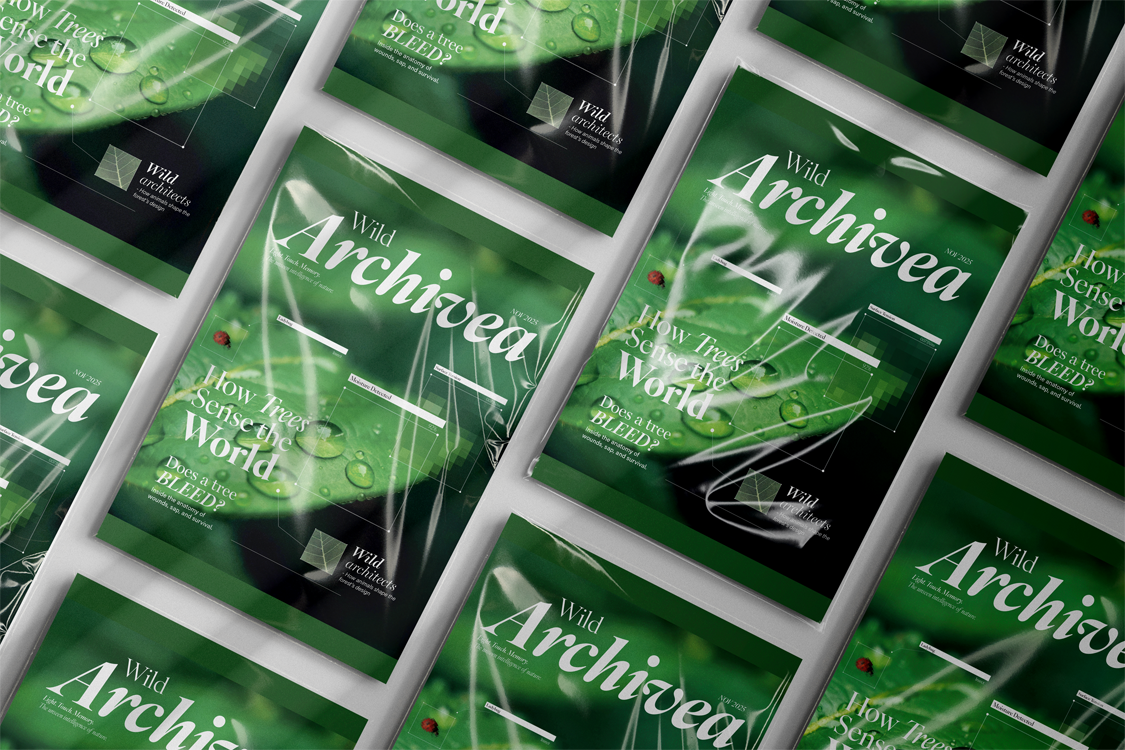
- The Masthead: The "Wild Archivea" logotype balances organic curves with archival stability, setting the tone for a collection of "recorded memories."
- Editorial Rhythm: The visual pace varies from dense, information-rich spreads like "Wild Architects" to open, airy features like "When the Earth Exhales," mimicking the changing density of a forest canopy.
- Natural Hierarchy: Key sections like "How Trees Sense the World" use large-scale botanical imagery as focal points, supported by clean, organized call-outs and diagrams.
- Integrated Branding: Advertisement mockups (O'Lumen, Aurora Vodka) were designed in-house to ensure that even the commercial "breaks" within the magazine maintained the project's premium, nature-focused aesthetic.
Visual Language
- Typography: An elegant, high-contrast serif for headlines to convey authority and grace, paired with a neutral, highly readable sans-serif for body text.
- Color: A core palette of Deep Forest Green, Soft Moss, and Warm Ivory to create a sophisticated, earthy feel.
- Imagery: A mix of macro photography showing natural textures (dew, bark, leaves) and clean, technical illustrations that bridge the gap between art and science.
Outcome
- Complete Editorial Prototype: A fully realized 10+ page magazine spread that demonstrates a sophisticated understanding of editorial hierarchy and storytelling.
- Cohesive Visual Identity: Successfully established a brand that feels premium and "slow," consistent across editorial content and internal advertisements.
- Systemic Design Logic: Created a reusable grid system and typographic style guide that ensures scalability for future issues.
- Enhanced Storytelling: Blended technical botanical information with emotive, sensory design to create an educational yet calming reader experience.
Tools
- Adobe Photoshop, Adobe Illustrator, Adobe Indesign, Adobe Premiere Pro, Adobe After Effect